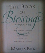
 This is the book we've all been waiting for. Poet Marcia Falk's "feminised" liturgy has been creeping out in dribs and drabs in New Age Jewish prayer communities for years. Unlike early rethinkings of Jewish liturgy, Ms. Falk has reconsidered the concept of blessing. Rather than substitute "female" for "male," she has given us new ways of giving thanks (e.g., "Blessed is the wellspring of creation...."), as well as liturgy for ceremonies of special interest to women (e.g., the New Moon). She has gone even further. Rather than retranslate the psalms, for instance, she has also drawn from new poetry, some her own, some of this century, often written originally in Yiddish. This, as much as the new prayers is a blessing and a pleasure. (Come to think of it, of course, that is what prayer is about!)
From a prayer perspective, this is a marvelous book, and one that will inspire many. At the same time, as is well known, I am not an expert on prayer. I am neither a scholar nor much ritually inclined. These web pages are here to use the book as an example of some of the do's and don't of good multilingual--in particular, in this case, Hebrew/English typography. Do not read further unless typography matters to you. For more on the book, itself, and when it will hit the shelves, contact HarperCollins, directly.
 I should first note that I set a bit of the display Hebrew (that which appears in the "Adah" typeface). As Marcia pointed out later in the process than I had time to work with, the vowels which were adapted for that typeface are an embarrassment. They were tacked on by me to a digitization of Adah that came with no vowels. The source came from a poor digitization of the marvelous Koren typeface. I ultimately redrew the vowels, but that came too late in the production process to incorporate into this book. Frankly, I was sloppy in part because I assumed that the vowels would be left off the display matter, as would be more common. But the decision was made to ensure that this book was a readable, or at least as pronounceable, as possible by its primary audience--people for whom Hebrew is not a native language, and for whom every courtesy and aid in reading should be supplied.
Vowels are a real problem with Hebrew. The truth is that they are generally considered an afterthought in most Hebrew typography--or for that matter--caligrahy. They are, after all, small diacritical marks, usually below the affected letters, unobtrusive, and yet, interfering with the typesetter's craft and layout. In Yiddish, they are more commonly used, but only a couple are required on a couple of letters, so a Yiddish character set will often contain those few versions of letters attached to vowels as separate characters. (This works because, in Yiddish, actual Hebrew letters are used in place of many vowels.) A look at the work of Hebrew scribes reveals that most dashed off the vowels as an afterthought. A look at Hebrew typefaces reveals that serious attention to vowels was not paid until the time of the abysmal typefaces of the last century, and the better, if not yet inspired faces of the early part of this century (Frank-Ruehl). Henri Friedlander did design good vowels for his wonderful '50s face, Hadassah (in which most of the Hebrew of this book is set--more on that shortly), but, in general, I find little source material, and few good examples of vowels. In modern Israeli Hebrew the pretence is that vowels are entirely unnecessary (in real life, few books or newspapers can be set entirely sans vowels, but Israelis try hard. And, in fact, very little Hebrew software for microcomputers supports reasonable placement of vowels--if it supports vowels, at all. Accent/Dagesh, by Kivun Software, Jerusalem, for Windows computers, being the one notable exception).
For early printers, vowels were also painful. The small characters had to be painfully spaced under each line of Hebrew. Readjusting lines must have been a nightmare, as it would have meant readjusting two interwoven strands of characters, each a different height, and one entirely visually depending on the other, but physically separate. At the same time, the most sacred Hebrew texts--the Torah scrolls, are never written with vowels. (Bound, printed copies of the Torah contain vowels, of course, but they are not holy in the same way.)
And, it is true, that for most Hebrew and Aramaic, vowels are generally unnecessary. They are important when the nuances of poetry, or the bible are being considered, or to ensure correct pronunciation of a word or name imported into Hebrew, but otherwise, who needs the headache? Well, as it happens, most Jews attempting to read Hebrew--most often either Israeli literature, newspapers, or religious materials. We are the first generations of Jews in, oh, about three thousand years who are most often illiterate, or nearly illiterate, in Hebrew. Whereas, in the middle ages a Benjamin of Tudelo could travel around the known world and connect to Jews wherever they were because all shared a common language, today, better one should know English!
But I digress. The Hebrew typography in this book is generally good, although it is clear that this was done on equipment not set up to handle Hebrew vowels, by people who don't know Hebrew well. There are occasional anomolies, especially with the "holem," a dot which introduces an "oh" sound, and which would normally appear above and between two characters without otherwise affecting the spacing between them (Tzi Narkiss, a wonderful Israeli type designer, would suggest that the holem appear on the forward shoulder of the consonant it affects, much as it appears on the "vav," but even in this case, the spacing between letters must maintain constant color, as though the vowels are not present. Sometimes, of course, this means adjusting that space so that the "color" does appear consistent, despite a confluence of tiny symbols above and below characters.
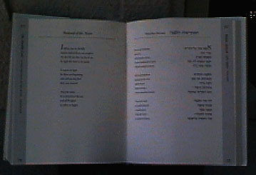
Onward. By most measures, this is a beautiful book, and one that will be easy to use. I very much love the side heads, turned towards the reader, for easy reference. Generous space (leading) between the lines also helps both readability (especially for the Hebrew, so that the vowels don't crowd the lines), and the aesthetic. The one major problem is the stubborn insistance that the transliteration and the Hebrew to which it applies be kept as far apart as possible, on opposite sides of the page (see verso--left-hand page--above). This is a common mistake. It is often committed so that the type will preserve the sense of "justified" margins--margins that are even on both sides of the page. It is an evil attack on the usefulness of any page. For a better example, take a look at this, below:
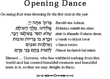
If your goal is grace and usefulness, you must, instead, always set the Hebrew and transliteration back to back: the English begins on the right, somewhat offcenter and further to the left than center. (Hebrew is invariably shorter, if only because of those pesky vowels that are set as diacriticals, not as inline characters.) The Hebrew begins about two ems to the left of the English, on the left-hand side of the page. Type set up this way will work with the reader, making it easy for the eye to pop back and forth between the Hebrew (I'm going to try to read it) and transliteration (let me just check my pronunciation). The image here is from a simple "Tu B'Shvat Seder Toolkit" that I did a few years ago to provide Hebrew resources via the Internet.
Of course, were one doing English and Hebrew without transliteration, the English would go next to the Hebrew, still, just as I have described it. In this case, we assume that we are presenting both texts together in part so that people can (or we arrange them knowing that human nature being what it is, people will) compare the two. In the case of this book, where there is Hebrew, transliteration, and translation, the translation is freqently below the two, or in a third column. In this book, David Bullen's wonderful design puts the English on the recto (right-hand) page, separated by the page division, a perfectly acceptable and lovely way to handle this part of the design.Thank you for the opportunity to discourse a bit on proper Hebrew typography. This page was written using BBEdit, and the images were taken by a Kodak DC20 digital camera (excepting the one screen shot), corrected on an Apple Powerbook 190 with only 4-bit color. This has been an opportunity for me to test this travel kit out and see how well (or how poorly) things will go as I hit the road in Eastern Europe.