 I haven't had time to post for months, but I felt a need to extend some props to Scott-Martin Kosofsky, whose lecture on his recent "Book of Customs" I caught today, to my great delight.
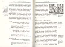
What Kosofsky did was to go back over the rich literature of Jewish handbooks from the Middle Ages: "The bestselling guide to Jewish life for more than three centures" on how to live a Jewish year, and put together a lovely amalgam, in English, and including a wealth of woodcut illustrations. This edition is inspired by the Yiddish language "Minhogimbukh", published in Venice, 1593.
As designer, author/translator, and typesetter, Kosofsky was able to create the sort of book that is a pleasure to hold and to look at, even before you begin to sink into the content. For Hebrew, he has chosen Vilna, a font that is truer to the type commonly used in these books, although not one that represents, in my mind, the best of Hebrew typography, then or now. I think we are past due for some revival faces based on those early Italian Hebrew fonts, or even the face, contemporaneous to the "Minhogimbukh" (but not used in it) by Le Bé, the French type designer who did, if I remember correctly, some early faces for Dutch and French printers.
Here is also a link to the NPR interview with Mr. Kosofsky from about a year ago (Sep 29, 2004) by Karen Grigsby Bates. It begins with an intro to Sukkoth.

Matthew Carter made a titling face based on Le Bé's larger Hebrew types, for use in Barry Moser's illustrated Pennyroyal edition of the King James Bible. I don't think it is generally available, though, and apart from the Moser publication the only place I've seen it is in the catalogue of an exhibition of Matthew's type design.
The Sephardic types used by the Soncini in the 16th century were among the influences for my SBL Hebrew type: http://www.sbl-site.org/resources/
Hi John,
Yes, I was thinking specifically of Matthew Carter's work when I suggested the revival of the Le Bé face. I would love to see it completed (it currently lacks vowels, punctuation, and composites) and generally available.
The SBL face also looks good at a quick glance. In fact, since it contains the Yiddish composites, and a wealth of symbols (trup) required for Biblical setting, it looks like a great font for someone looking for a general purpose, old-style font. Thanks for the pointer!