Page on Schonfield "New Hebrew Script"
 In my correspondence with Rabbi Bruce Pfeffer, he happened to mentioned that Hugh Schonfield's book on "New Hebrew Typography" (London, 1932) was impossible to find. What he didn't know, and I didn't know until I went looking for it, is that there is a webpage devoted to this curiosity, in which "... Schonfield ranted about his dissatisfaction with the Hebrew writing system. His complaints included a limited selection of typefaces, the lack of a captial-lowercase distinction, and finding Hebrew type ugly. His solution was to revise how Hebrew was written...."
www.geocities.com/snortar/schonfield.html. Enjoy.
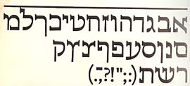
 Schonfield wasn't alone. In Eastern Europe, during the Hebrew Revival (late 19th century, early 20th) of the Eastern Haskalah (Enlightenment), my memory, from a book read during Young Judaea summer camp in Texas some 35 years ago, is that there were several. And I'll up the ante with this sample of the Hebrew face that Eric Gill designed. According to Moshe Spitzer, in his article, "The Development of Hebrew Lettering" (Ariel, No. 37, 1974), the type was originally cut in stone by Gill. It is actually used for display purposes in Israel today. Clearly, Gill was trying to do for Hebrew what that poor pair of Dutch typographers hired by Peter the Great did for Old Slavonic: Make it look more like Latin.